Address
304 North Cardinal St.
Dorchester Center, MA 02124
Work Hours
Monday to Friday: 7AM - 7PM
Weekend: 10AM - 5PM
Address
304 North Cardinal St.
Dorchester Center, MA 02124
Work Hours
Monday to Friday: 7AM - 7PM
Weekend: 10AM - 5PM

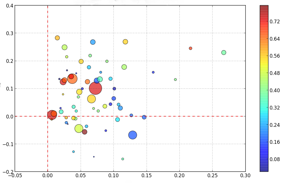
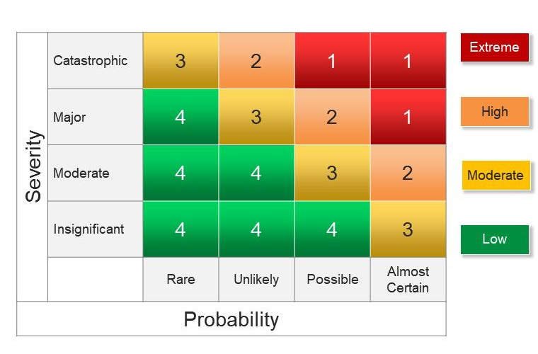
Heat maps are graphic representations of information that use color-coding and relative size to display data values. They are commonly used to visualize and analyze large data sets but can be an indispensable part of the change manager’s arsenal too. Heatmaps are a useful tool for analyzing and communicating complex information clearly and intuitively. And change is nothing if not complex.
Heatmaps typically display values as colored squares or dots, where the color represents the magnitude of the underlying value. Darker colors usually represent higher values; lighter colors represent lower values. Many infographics vary this by making the dot or square larger (or smaller) in accord with what it’s representing.
Benefits of heat maps include:
Specifically for those leading and managing change, well-placed heatmaps have very practical use. In at least one case below, they are probably being employed already.
Heat map help visualize information related to the initiative, such as employee engagement or performance metrics. Colour and size visualizations quickly identify areas of strength and weakness, so efforts can be focused accordingly. Picture Superiority effect is a psychological bias that explains this, asserting that we… tend to prefer pictures.
Heatmap can highlight key stakeholders who may be particularly influential or resistant. By analyzing the data and identifying these stakeholders, targeted strategies can be developed for engaging and communicating with them (and others, really). Prosci, for certain, recommends this as part of how they recommend development of sponsorship models.
Heatmap are great for quickly tracking progress and change of an initiative over time. Monitoring and displaying key performance indicators in a heatmap renders obvious any areas where progress is being made… and areas where added effort may be required.
Heatmaps are a vivid and powerful means for communicating insights and findings to stakeholders. The visual format is easy to understand, so stakeholders readily gain a better understanding of the initiative and its impact.
Bottom line: Heat maps help change leaders and managers—and stakeholders—make more informed decisions.
There are a few key things change leaders and managers should focus on when choosing to use heatmaps.
Overall, the most important thing for change leaders and managers to focus on when using heatmaps is to use them to gain meaningful insights into the change initiative, and to communicate these insights effectively to stakeholders. By doing so, they can help drive change and ensure the success of the initiative.
The Change Playbook is loaded with practical tips and pragmatic guidance for all aspects of making change happen. Check it out. Subscribe to be notified about new posts and fresh content.
Comments are closed.

Your writing has a softness to it that invites reflection, offering space for deeper thought.